 |  |
| Figure 1. Nightingale and her data visualization (click to enlarge) | |
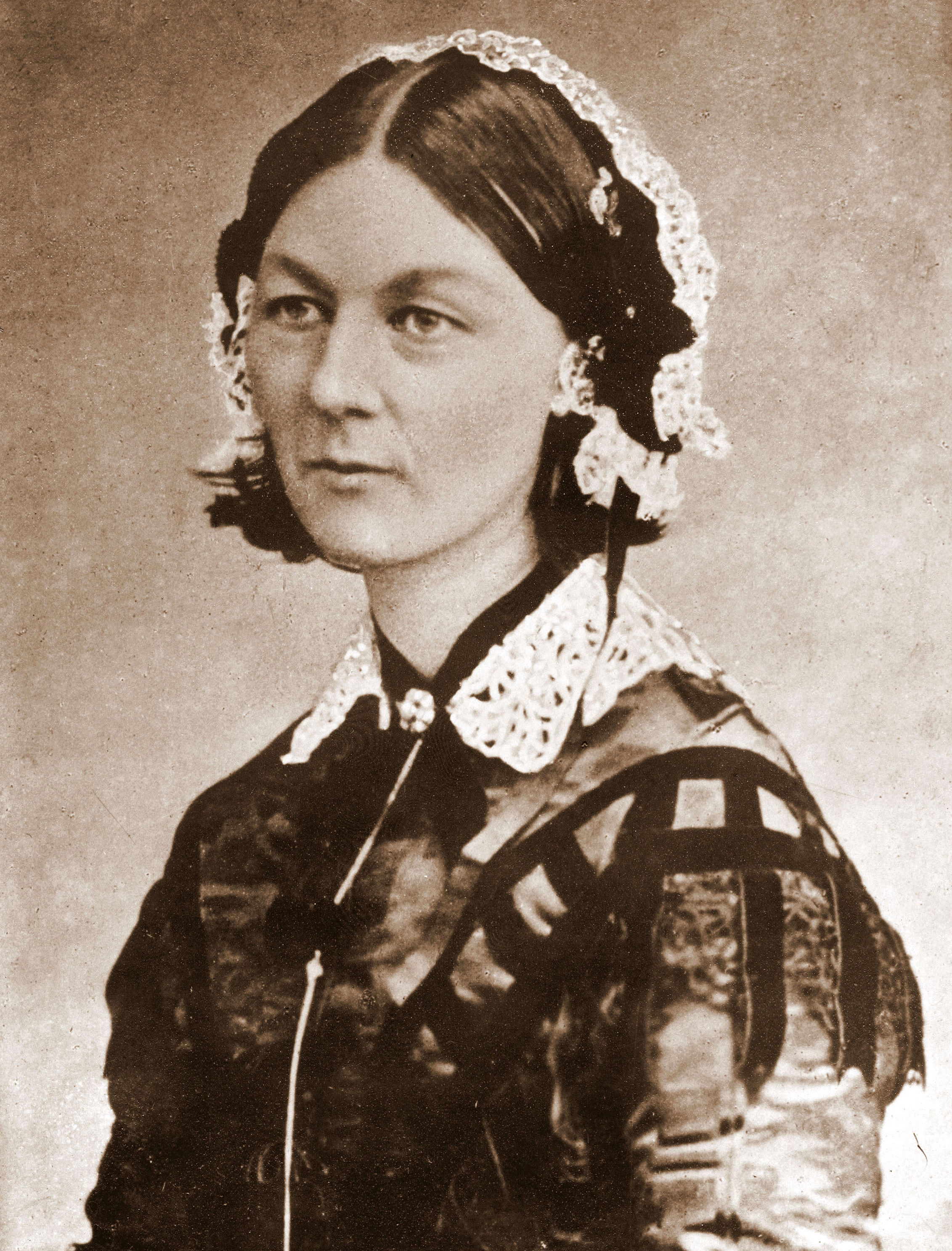
Although Florence Nightingale was not formally trained as a statistician, she apparently had a natural aptitude for mathematical concepts and clearly put a lot of thought into how to present her medical findings in a visual way that would best convey their import: the wedge diagrams in Fig. 1 (click to enlarge). As a consequence, she was elected the first female member of the Royal Statistical Society in 1859 and later became an honorary member of the American Statistical Association.
Why Wedges?
Why did FN bother to construct the data visualization shown in Figure 1? If you read her text in the enlarged view, you see that she refers to the sectors as wedges. In a nutshell, her point in devising Figure 1 was to try and convince a male-dominated, British bureaucracy that better sanitary methods could seriously diminish the adverse impact of preventable disease amongst military troops on the battlefield. Later on, she promoted the application of the same methodologies to public hospitals. She was using the previously established term, zymotic disease, to refer to epidemic, endemic, and contagious diseases.Today, it is hard for us to fully appreciate how innovative her ideas were at that time, and the resistance with which they were met. Her methods for disease prevention were highly contentious in the mid nineteenth century. The social historian, Hugh Small, tells us in "Did Nightingale’s ‘Rose Diagram’ or ‘Coxcomb’ save millions of lives?" that even with her famous wedge visualization, conveying her message of sanitary reform wasn't smooth sailing. In fact, it seems that something akin to modern blog wars broke out, with many pro and con pamphlets being published about FN's methods.
The visual message of FN's diagram was essentially this. Based on data collected during the Crimean War, the large, outer, gray wedges on the right circular diagram in Fig. 1 represent the level of disease before the introduction of her sanitary methods. The circular diagram on the left side represents the level of disease for the following year, after the introduction of FN's approach. In this visualization, smaller is better.
Of course, you have to actually read the annotations on her diagrams to understand that she has positioned the data as though they were on a clock face and should therefore be read clockwise, and so forth. It's all very compact. But, as the FN story demonstrates, even if you have created what you think is a good visualization (usually PerfViz, in our case), it may not pay off in the way you were expecting. If that happens, you will need to keep rethinking your visual paradigm and possibly go even further. How to go further is what I shall consider in this and the subsequent blog post.
Hereafter, I'm going to take the liberty of calling Fig. 1 a Cam Diagram because her term "wedge" is now applied to pie charts; which FN's diagrams most definitely are not. A pie chart is a circular diagram with fixed radius and wedges with different angles that represent the relative magnitudes of the data. Instead, FN's diagrams are equi-angular sectors with variable radii representing the magnitudes. They remind me of a cam: a kind of gear wheel with variable radii teeth that move an associated lever differently as it rotates.

Calling it a Cam diagram seems to me to be no worse than the now ambiguous Wedge diagram, the even more implausible Rose diagram (with non-overlapping petals?) or the ghastly Coxcomb diagram (which isn't even round on a bird's head). Moreover, as far as I can determine, no one has previously used the term "cam" for any similar diagrams. But I won't put any money on the term sticking.
Cam Diagrams in R
In a blog post entitled, Florence Nightingale and the importance of Data Visualization, Hernán Resnizky used the R Plotrix package to recreate the FN wedges of Fig. 1. I tried the same thing with just the zymotic data (the outer wedges), since that's what I'm going to focus on in the subsequent sections.
require(plotrix)
require(zoo)

fn <- read.table("../fn.data",header=TRUE,sep="\t")

dates    <- as.Date(as.yearmon(fn$Date, "%b %Y"))
MthlyZym <- (fn$DeathZym/fn$ArmySize) * 1000
MthlyWnd <- (fn$DeathWnds/fn$ArmySize) * 1000
MthlyAll <- (fn$DeathAll/fn$ArmySize) * 1000

op <- par(mfrow=c(1, 2), pty="s")
par(cex.axis=0.5) # shrink outer labels for mfrow mode
par(cex.lab=0.5)
permudates12bef <- c(as.character(fn$Date[7:12]), as.character(fn$Date[1:6]))
fnstart12 <- 2*pi*6/12 # start at pi radians
radial.pie(sqrt(MthlyZym[1:12]), clockwise=TRUE, show.grid.labels=TRUE,
   start=fnstart12, labels=permudates12bef, label.prop=1.1, sector.colors=rep("cornflowerblue",12))
radialtext("X", center=c(-10.5,0),col="red")
title(main="BEFORE: Apr 1854 - Mar 1855") # main arg doesn't work

permudates12aft <- c(as.character(fn$Date[19:24]), as.character(fn$Date[13:18]))
fnstart12 <- 2*pi*6/12 # start at pi radians
radial.pie(sqrt(MthlyZym[13:24]), clockwise=TRUE, show.grid.labels=TRUE, start=fnstart12,
 labels=permudates12aft, label.prop=1.1, sector.colors=rep("blue3",12))
radialtext("X", center=c(-5.5,0),col="red")
title(main="AFTER: Apr 1855 - Mar 1856")
par(op)
I ran into a number of issues with Plotrix while putting the above R code together:
- The main argument does not work. It never appears in the R-function code body.
- Rotation of the zymotic data to visually match the original FN diagram orientation can be accomplished with the start argument. It certainly rotates the data but not the radial axis labels (i.e. the dates). So, the data can end up out of alignment with the axes. This lack of coordination could easily escape your attention.
- There is a strange 'O' character that appears on the left-hand side of individual plots. It may be an attempt to indicate the origin axis.
- Using mfrow=c(1, 2) to get the cam plots side-by-side like Fig. 1, there seems to be two labels denoted by 'index' in a second undefined row. This may be related to the 'O' strangeness.
- If you use par(cex.lab=0.5) for the axis labels, you are advised to call dev.new() to reset the viewport correctly when outputting successive plots. Otherwise, you may find the labels messed up on successive plots.

Several important differences emerge as a consequence of applying modern data visualization tools, like Plotrix, to FN's data:
- The BEFORE data is on the left, the AFTER data on the right of Fig. 3. This is consistent with the ubiquitous convention of time moving left to right, but opposite from the order in Fig. 1. This is not an option today. Your audience can easily be thrown off your point if you violate that time-flow convention.
- The circular paradigm is that of a 12-hour clock. However, instead of starting in the 12 o'clock high position, for example, FN starts at the 9 o'clock position (denoted by an X in Fig. 3). The data is then read clockwise in both Figs. 1 and 3.
- Why did FN start in the 9 o'clock position? In fact, there are two 9 o'clock positions, one on each cam plot, corresponding to the X marks in Fig. 3. However, these are really the same point. But since FN chose to employ two 12-month clocks, as it were, she is left the problem of tying them together. Having the wedges overlap on a single clock would be too visually disruptive. So, she introduces the horizontal elbow-line. (not shown in Fig. 3) My guess is that her choice had to do with using landscape rather than portrait layout. In other words, tying the two clocks together in a horizontal sequence. This choice might have been made as a convenience for printing or simple readability: we read horizontal rows of characters in English.
- FN probably positioned her BEFORE cam diagram on the right-hand side because when you've gone around once, you are back in the 9 o'clock position. If she had used the relative positioning in Fig. 3, that puts you to the far west of the 9 o'clock position of the AFTER data. By reversing the BEFORE and AFTER plot positions (as in Fig. 1), FN only needed to add a thin elbow-line to join the two 9 o'clock positions without crossing over any wedges. It's the least visually disruptive solution for two 12-hour cam plots.
- The AFTER cam plot in Fig. 3, shows the data sectors at the same visual scale as the BEFORE data. The "smaller is better" cue of Fig. 1 is lost. It's a consequence of sometimes having less convenient control with modern tools. The fact that the magnitudes are actually smaller is indicated by the numerical radius scale, which has to be consciously read—just like one has to read the dates in Fig. 1.
- The radial magnitude is in proportion to the square root of the sector area. This is not apparent in FN's cam plots and there is no way to tell without numerical indicators. From a purely visual standpoint, you don't need to know. But more on that below.
- In principal, it would be possible to rescale the AFTER sectors to match the FN sectors, but it's non-trivial with radial.pie().
Putting all that to one side, a more important question would seem to be: why do we need two plots? A better solution for comparing the relative magnitudes would seem to be to plot both data sets (over 24 months) on a single cam diagram like Figure 4. This alternative is easily achieved with radial.pie().

There's no doubt that FN had her reasons for presenting her data the way she did and she certainly deserves all the credit she gets for doing that a century and a half ago. But it's clear from Fig. 4 that both 12 month periods can be plotted on a single 24-month cam diagram with the same or better visual effect; especially when accented with colors (in a manner only slightly different from Fig. 1). And since it then resembles a 24-hour clock (military time), we can start at the top in Figs. 1 and 3 (denoted by an X), rather than the more arbitrary 9 o'clock position in Figs. 1 and 3. I also tried using clock24.plot() but I found radial.pie() had more flexibility.
Personally, I now have to wonder if the single 24-hour cam diagram in Figure 4 might not have helped FN make her point even more simply and directly. But, I'll leave that for the historians to argue over.
From the discussion so far, we now see that there are several choices available for clock-style layouts, of which FN chose one. As mentioned earlier, without a numerical scale in Fig. 1, it is not obvious that the radial lengths of FN's wedges are not equal to the disease intensity. Understanding this point is important for appreciating the visual message FN wanted to convey, and it will also provide us with a convenient segue for going beyond FN's choice of visualization.
Square Root of Cam
The radial lengths in Fig. 1 (and Fig. 3) are not proportional to the data magnitudes, as they would be in a modern polar plot, for example. Instead, the data magnitudes determine the area of the wedges. In this section, I will explain why FN did that.
In Fig. 5, all the shapes have the same area, viz., $A =16$ square units. The red column has a width $w_{col} = 1$ unit and it's height is $h_{col} = 16$ units. The corresponding area is therefore $A_{col} = w_{col} \times h_{col}$ or 16 square units. This is the situation with all bar charts and histograms where the columns each have the same default width. The height of a column is proportional to its area: bigger datum, taller column. The problem with columns is that data with large variations in height tend to swamp those columns belonging to more moderately varying data.
One way to combat that bias is to represent the areas by squares. In Fig. 5, the green square has exactly the same area as the red column. However, since the square is broader than the column, $w_{sq} = 4$ units, it's height is only $h_{sq} = 4$ units. In other words, the height of the green square is proportional to the square root of its area (16 square units). Being more squat, this solves the problem of excessively high columns. On the other hand, it introduces the new problem of displaying columns with very different widths. Visual comparison along the x-axis now becomes very difficult.
A compromise between these two cases, and the one that FN chose, is to use sectoral areas. In Fig. 5, the blue sector has the same area as both the red column and the green square. Clearly, the sector is taller than the square, but it is much shorter than the column. In Fig. 1, each of FN's wedges represents one twelfth of the circle (one hour on a clock face) in order to accommodate 12 months of data. Each sector has the same angle. The fixed angle is therefore $\theta = 360/12$ or 30 degrees. So, for a given area (datum magnitude), we next need to determine how tall the sector should be.
You can see from Fig. 5 that the arc width at the top of the blue sector is about the same as the width of the green square, viz., 4 units. From there, the sector has to taper down to zero width at the x-axis. The arc width for a radius $r$ and angle $\theta$ is $r \theta$. The area of the sector is given by the radial distance from the x-axis to the arc (height) multiplied by the the arc width: \begin{equation} A_{sec} = \dfrac{1}{2} \, r \times r \theta \end{equation} Wait! Where did that factor of a half come from?
If we assume the arc width to be approximately the same as the width of the green square (i.e., 4 units) then, positioning that arc at a height of 8 units above the x-axis would produce a rectangular area of $4 \times 8 = 32$ square units. But, since the sector tapers at the bottom, the blue area is actually closer to a triangle with half the area of the assumed rectangle, i.e., $\dfrac{1}{2} \times 4 \times 8 = 16$ square units (as required). The actual value of the radius is $r = 7.82$ units because the arc width ($r\theta$) is slightly longer than the width of the green square—it's curved.
A sector (FN's wedge) provides a nice compromise between variable-height columns and variable-width squares. However, it's also clear from Fig. 5 that a linear array of sectors would have problems when it comes to registering them numerically with the x-axis. This problem is easily overcome by simply abutting all the sectors into a circle. Hence, the circular distribution of wedges in Figs. 1, 3 and 4.
Summary
The point of all this is to convince ourselves that FN applied sectoral areas, instead of histogram columns or the classic pie chart wedges (pie charts did exist in her day), to reduce the visual impact of high variance in her data. In particular, she wanted to counter any criticism that diminishing zymotic disease was due to seasonal effects (like onset of spring weather) and not her sanitation methodologies. The square-root attenuation derived from employing sectoral areas in Fig. 1 accomplished that.However, as I plan to show in the next installment, there are other ways to reduce the visual impact data variance that also lead to a deeper insight into the underlying dynamics of FN's data.
R-bloggers.com offers daily e-mail updates about R news and tutorials on topics such as: visualization (ggplot2, Boxplots, maps, animation), programming (RStudio, Sweave, LaTeX, SQL, Eclipse, git, hadoop, Web Scraping) statistics (regression, PCA, time series,ecdf, trading) and more...